The Edge in NYC
Learning the fundamentals of design & composition
In this project I created a single-page web flow for an online feature article titled “The Edge in NYC: Where Poetry Meets Concrete.” I created the branding and overall look and feel for the site to frame the specific article.
Project Date: February 2019
Annotations
Process
Competitive Research
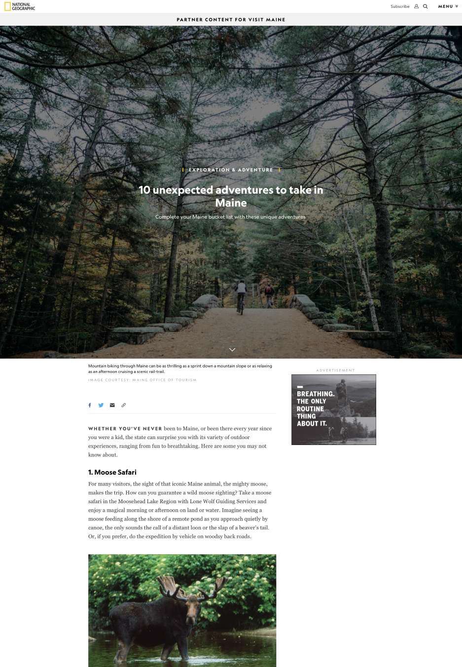
I took particular inspiration from the IDEO and National Geographic online magazines for their full-screen header images, the tab-switching format (simple underline), typography style, and method of transitioning from the header to the text body, including the “hook” blurb.
Greyscale Sprints
In preparation for constructing the final page flow for “The Edge in NYC,” I did a few grayscale sprints focusing on the layout of space. Three are included here. I also did these in Photoshop, and focused on the flow of the eye down and across the page to desired items. The third features hint of color as I began to think about the final spread and experiment a touch with this bright electric blue.
Iteration 1
This was my first high-fidelity iteration. I felt there was an awkward transition from the header to the main body text in which the eye became lost in the space in the middle. I addressed this problem in my second iteration (above) by extending the main title into the page from the image to more definitively catch the eye in the first place, and then extended the electric blue line from the subtitle down through the hook paragraph and then back across the page to have the eye catch on the bigger leading letter of the main article text (see above).


