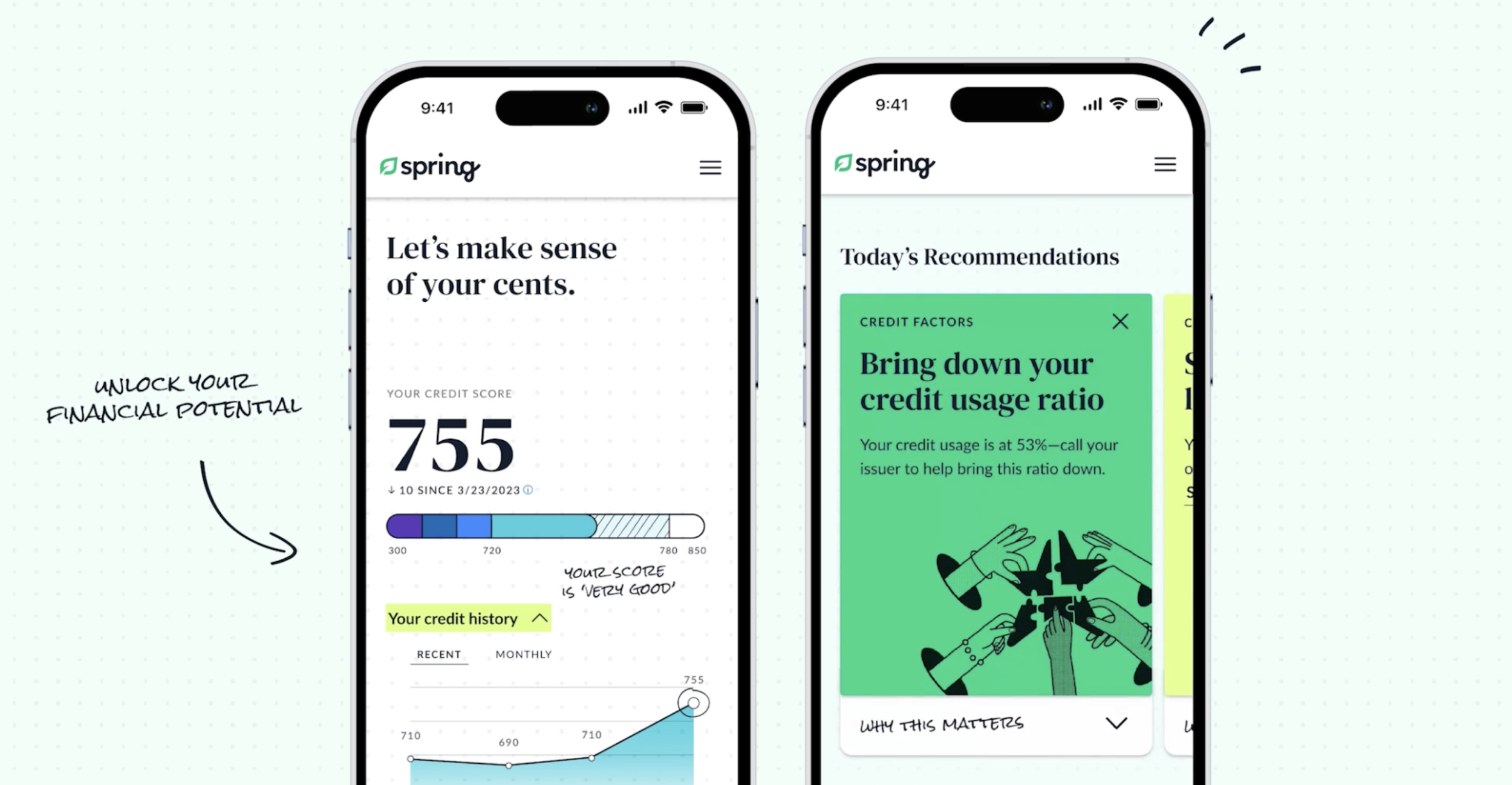
Architecture for a revitalized experience
The problem
A consumer-facing financial services company came to us to help conceptualize, build, and launch a new feature to become the focal point of their entire brand experience, across mobile, web, and throughout their marketing interactions (emails, social media, etc.). An enormous project, the team started with JTBD work, experience visioning, and deep understanding of the company and its landscape.
I came into the project when the team reached the point to actively start defining the feel and features of the brand experience. It was a really exciting boiling point, with lots of conviction, enthusiasm, and ideas on ideas on ideas flying around. There was a lot of language, a lot of lingo, a lot of heart—and also growing confusion.
The process
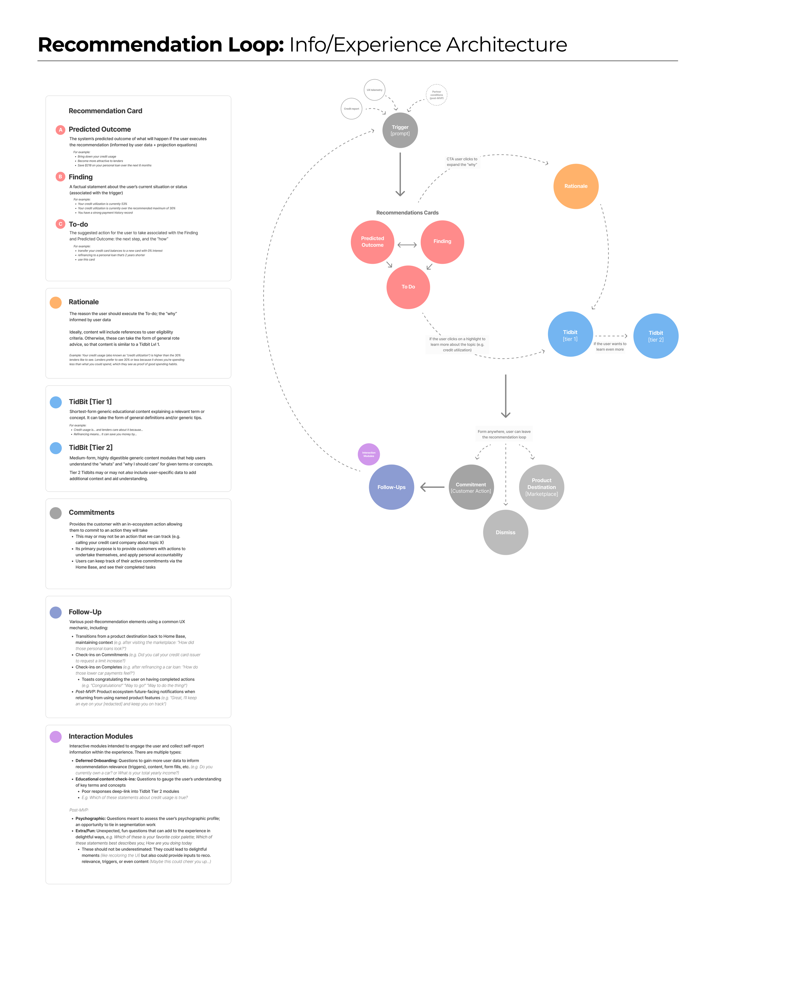
I wanted to take a stab at codifying the features, language, and general spirit of the main part of the experience—which was at its core, as I heard it, a recommendation loop. I defined this architecture to help organize the team in its ideas for how the core of the experience would function.
I created the document and used it to guide conversations across tech, developers, experience design, experience strategy, research, UXers, and UI designers. I made iterative changes as I went from conversation to conversation over the course of weeks, to solidify and codify details. Definitions were written into the project management plan from there, and people continued to use the diagram as a reference to see how all the pieces fit together.
The result
The architecture I documented and developed ended up being an enormously organizing force for the technology, experience design, research, experience strategy, UXers, UI designers, and even executive parts of the team to rally around and discuss the architecture of the experience—to get on the same page before real production began.
And best of all—the experience itself is now live! And it was a Webby 2024 Honoree for Best User Experience! It’s grown beautifully since this diagram was last touched—when design and development began to pick up and grow wings of its own, as it should—and I’m proud to be a user. It’s incredibly rewarding to feel the backbone that I helped to define come through the muscle and beauty of this experience.
The architecture I codified also informed the Voice guidelines.


